Creating a Landing Page That Actually Converts Visitors into Customers
Let’s be real – driving tons of traffic to your site is great, but if those visitors aren’t converting into leads or sales, it’s kind of a deflating moment.
We’ve all been there. You launch an amazing social campaign, get loads of clicks, but then barely any calls or form submissions come through. Cue the frustration.
Surprisingly, where the problem usually lies is in your landing page. It’s like the virtual front door to your business – if it’s not optimized to convert, or there’s a technical issue preventing some users to move forward, you can be missing out on converting visitors. Unfortunately for many, creating landing pages that convert well is a struggle.
But have no fear. With the right strategy, creating a good landing page is simple, and usually the easiest way to leverage more of those clicks into actual customers.
In this guide, we’ll walk you through how to create a landing page that converts like crazy. We’re talking best practices for design, copywriting, trust-building, and more.
Whether you’re just starting out or looking to improve your existing pages, you’ll discover actionable tips to:
- Better understand your target audience so you can make simple changes that convert visitors
- Set clear goals aligned with your marketing objectives
- Easily incorporate compelling copy, visuals and multimedia
- Continuously test and improve your page over time
We’ll also dive into real-world examples that can inspire your own landing pages.
By the end, you’ll know how to create a good landing page that wow’s your audience and drive more sales. Ready to get started? Let’s do this!
Get to Know Your Audience Inside and Out
Imagine opening an Idaho-themed online gift store, but you’re advertising only to those in Colorado. Probably not a great strategy, right?
Well, the same idea applies to your landing page. You need to deeply understand who your target audience is before creating a page for them. Or, at the very least, what problem they are trying to solve.
Your page should speak directly to your ideal customer avatar (aka buyer persona). It should resonate with their preferences, address their pain points, and present your solution as the perfect fit for their needs.
This is where buyer persona research comes in handy. Define detailed profiles for each of your major customer segments and get familiar with:
- Demographics like age, gender, location, job title
- Values and motivations
- Common objections and pain points
- How they consume information
The good news is, if you are involved in the business you are building the landing page for, you probably have a lot of experience with your existing customer base to draw from. What do they respond to? What motivates them? Translate any of your personal experience into your landing page design. Look for patterns in your existing customer base.
You need to keep these buyer personas top of mind when crafting page content. Think about specifics like:
- Tailoring the page layout and visuals to their aesthetic preferences
- Using language and messaging that speaks to their goals
- Addressing common questions and concerns upfront
It’s all about crafting a personalized experience. Believe it or not, a personalized page experience is much more valuable than your landing page looking “well designed”. When visitors feel the page “gets them”, they’re much more likely to convert.
Pro Tip: Create Dedicated Landing Pages for Your Most Profitable Buyer Personas
Instead of trying to appeal to all your potential customers with one generic landing page, consider creating dedicated pages that speak to each of your core buyer personas.
For example, if you sell software to both technical and non-technical users, you could have:
- One landing page focused on features and capabilities for the engineers/IT pros
- Another landing page focused on simplicity and user-friendliness for business leaders
This allows you to customize the copy, visuals, and offers to align with the specific needs of each segment. Just make sure your ad copy and landing page aren’t mismatched.
You can take it a step further by creating tailored landing pages and sales pages for different stages of the buyer’s journey. For instance, pages targeted to:
- New visitors in the awareness phase
- Visitors who are already familiar with you for consideration
- Decision makers ready to convert
The benefit of all this segmentation? It filters visitors into a personalized experience, increasing relevance and conversion rates. Again, just be sure that you are segmenting your targeting, messaging, and landing page copy to the proper audience. This can be an advanced technique, and usually most successful when managed by a professional.
We’ll dive more into optimizing content for your audience next. But first, you need crystal clarity on those all-important goals for your page.
Set Crystal Clear (and Measurable) Goals
Before you design your landing page, you need to define what its purpose is. Clarity of goals gives your page direction and enables you to benchmark success.
Let’s make this super specific. Do you want visitors to:
- Sign up for your newsletter?
- Purchase a product?
- Download an ebook?
- Attend a webinar?
Setting a single, measurable goal like this keeps the page focused. If you try to accomplish too many things, you’ll only succeed in overwhelming visitors, and your conversion rate will suffer for it.
The secret is that high-converting landing pages all have in common is that they are clear on their goal for the page, and they have clearly outlined the goal of the audience that has landed on the page.
Your goals should also align with broader marketing objectives. Your landing page doesn’t exist in a vacuum. It should integrate seamlessly into your sales funnel and customer journey.
This helps ensure messaging is consistent across campaigns. The last thing you want is disjointed branding and experiences.
The Key to Unlocking Conversions: Strategic Call-To-Actions
Now here comes the most important part – the call-to-action (CTA). This button or link prompts visitors to take your desired action.
An effective CTA:
- Uses compelling command language like “Start Your Free Trial”.
- Uses “you” instead of “we” language
- Contrasts from other elements on the page (red button on a blue background, for example)
- Is strategically placed above the fold and near conversion points
Test different CTA variations to learn what resonates best with your audience. The right CTA can be the difference between a page that fizzles and one that sizzles.
By setting clear and measurable goals, you provide a roadmap for your landing page’s success. The next step is to translate these goals into a visually appealing and user-friendly design, which we will explore in the upcoming section on designing an eye-catching layout for your high-converting landing page.
Create a Visually Appealing Design
Remember – you only have a few seconds to make a good first impression on visitors before they leave. A clean, polished landing page design showcases professionalism and builds trust.
Some best practices for eye-catching landing pages:
- Use plenty of whitespace. Don’t overcrowd the page.
- Make sure colors, fonts, and imagery align with your brand style guide. Consistency matters.
- Direct attention with visual hierarchy. Draw the eye to important elements like headlines and CTAs.
- Mobile optimization is a must. Test across devices to ensure responsiveness.
- Choose images that connect with your audience and reinforce your message.
- Use videos or GIFs to explain complex products or services.
Not a designer? No worries! Look for professionally designed templates to use as a starting point. Many platforms like Instapage, Unbounce, or Leadpages have great options.
Remember to keep the visitor experience in mind. Remove anything that distracts from your goals. Less is often more when it comes to effective landing page design.
Utilizing a Clean and Visually Appealing Design
- Simplify for Impact: Embrace simplicity in design. A clutter-free layout with ample white space directs the visitor’s focus to the essential elements. A visually clean design contributes to a positive first impression.
- Consistent Branding: Ensure that your landing page aligns with your brand’s visual identity. Consistent use of colors, fonts, and imagery reinforces brand recognition and builds trust with your audience.
- Strategic Use of Visual Hierarchy: Organize content with a clear visual hierarchy. Prioritize important elements through size, color, and placement to guide visitors through the desired flow of information.
Importance of Responsive Design for Various Devices
- Mobile-First Approach: Given the prevalence of mobile users, prioritize a mobile-first design approach. Ensure that your landing page is responsive and offers a seamless experience across devices, including smartphones and tablets.
- Cross-Browser Compatibility: Test your landing page on different browsers to ensure a consistent experience. Cross-browser compatibility is essential to reach a diverse audience and prevent potential usability issues.
- Adaptive Images and Media: Optimize images and multimedia elements for different screen sizes and resolutions. Adaptive content ensures that your visuals maintain quality and clarity regardless of the device.
Best Practices for Color Schemes, Fonts, and Imagery
- Strategic Color Selection: Choose a color scheme that resonates with your brand and evokes the desired emotions. Consider the psychological impact of colors on perception and use them strategically to guide user behavior.
- Readable Fonts: Prioritize readability with clear and legible fonts. Maintain a consistent font hierarchy to enhance content comprehension. Aim for a balance between aesthetic appeal and user-friendly readability.
- Engaging Imagery: Select high-quality images that complement your message. Use visuals that resonate with your target audience and evoke the desired emotions. Original, authentic imagery can enhance the credibility of your landing page.
Want an Easy Way Out? Utilize a Facebook Form
Sometimes, especially if you are running a simple campaign on Facebook and you are looking for your audience to fill out a form or sign up for a service, utilizing a simple Facebook form can be incredibly effective. The form itself, native to Facebook, becomes your “landing page”, and you don’t have to worry about building an entire landing page. This method is not for every business, and we don’t recommend it all the time, but it can be just as effective as even a perfect landing page because it keeps your audience on the same platform, reducing friction.
In the next section, we will explore the art of crafting compelling copy that not only communicates your message effectively but also persuades visitors to take action. Crafting impactful copy is a crucial step in creating a high-converting landing page that resonates with your audience.
Craft Persuasive Copy That Sells
Your words on the page are equally as important as the design. Compelling copy instills confidence in your offering, addresses concerns, and motivates action.
Follow these tips to create magnetic landing page copy:
- Craft a clear, benefit-driven headline that sums up your value proposition.
- Use descriptive subheads and bullet points to make skimming easy. Chunk content into scannable sections.
- Focus on you, you, you. Cater messaging directly to your target audience and their needs using “you” language.
- Weave in subtle urgency cues like “for a limited time only” or “act now and also get XYZ bonus” if possible.
- Build trust with proof elements like customer stories, reviews, guarantees, certifications, etc. Social proof is hugely persuasive.
- Avoid generic, overused claims. Showcase how you stand out from competitors and keep your message simple.
- Outline the next steps and make your CTA copy ultra-compelling.
Remember, copy is never “set it and forget it”. Continuously test new messaging and offers to identify what resonates most with your audience.
Helpful tools like Grammarly, Hemingway Editor and CoSchedule Headline Analyzer can optimize your copy too.
Pro Tip: Follow the AIDA Model for Landing Page Copywriting
The AIDA model provides a proven framework for guiding visitors down the conversion funnel using your copy.
AIDA stands for:
- Attention – Capture interest with a compelling headline and intro.
- Interest – Spark desire by articulating benefits and value.
- Desire – Convince visitors your solution is the best choice for them.
- Action – Motivate next steps and guide to conversion
When writing copy, move sequentially through each AIDA stage:
- Grab attention with a strong hook. Appeal to emotion with questions, analogies, or by painting a scenario.
- Describe how your offering solves pain points. Focus on You – Your -Yours language.
- Provide social proof of value. Weave in testimonials, ratings, press mentions.
- Close with a clear CTA and urgency cue. Limit the risk with guarantees, trials, or pricing incentives.
Following the natural AIDA progression will help create copy that guides visitors down the conversion path. Now go grab their attention!
Build Trust with Social Proof and Credibility
People are cautious by nature. Especially those who have never heard of your brand or product. Before converting, visitors need to trust your business and see value in your offering.
You can help instill confidence by including authentic social proof like:
- Customer testimonials – Include real photos/videos along with specific benefits experienced.
- Case studies – Show quantified results from real customers.
- Reviews and ratings – Display genuine verified reviews from external sites like Google, Facebook, or Trustpilot.
- Logos of recognizable brands you’ve worked with.
Third-party credibility also goes a long way. Show certifications, awards, or associations relevant to your industry. For example:
- “Best Company Award 2023”
- “Certified Sustainable Business”
- “Member of [Industry] Trade Association”
For e-commerce, include trust badges like Norton Secured or McAfee Secure to assure visitors their data is safe.
The more you can organically embed proof of value throughout your page, the more authority you build with the visitor.
Showcasing Industry Certifications and Awards
- Certifications and Accreditations: Display any relevant industry certifications, awards, or accreditations your business has received. These badges serve as tangible proof of your expertise and commitment to quality.
- Third-Party Endorsements: If your business has been endorsed or featured by reputable third-party organizations, such as the Better Business Bureau, showcase these endorsements on your landing page. External validations enhance your credibility.
- Association Memberships: If your business is a member of industry associations or professional organizations, include their logos on your landing page. Association memberships signal your commitment to industry standards.
Including Trust Badges and Secure Payment Icons
- Security Seals: Display trust badges that indicate the security measures in place on your website. Icons such as SSL certificates and secure payment logos reassure visitors that their sensitive information is protected.
- Money-Back Guarantees: If applicable, prominently feature any money-back guarantees or risk-free trial offers. Clearly communicating your commitment to customer satisfaction reduces perceived risks for potential customers.
- Transparent Policies: Provide links to clear and transparent policies, such as privacy policies and return policies. Open communication about the terms of the transaction builds trust.
Incorporate Multimedia to Showcase Your Offering
This is especially true in 2024; you need visual content to effectively capture attention and convey information. Strategically incorporate multimedia like:
- High-quality images and videos to engage visitors and bring your page to life. Ensure they align with your brand style. Use an image of the product or service in the hero image if possible so visitors
- GIFs or animations to explain a complex value proposition in a digestible way.
- Product tours, demos and explainer videos to showcase your offering so visitors can experience it for themselves.
- Client success stories transformed into video testimonials for authenticity and emotion.
- Interactive content like calculators, assessments, configurators to involve visitors beyond static copy.
- Information graphics or infographics to communicate complex data and statistics clearly.
Multimedia amplifies your copy in a memorable way. But keep files sizes optimized for quick loading, and include captions for accessibility.
Using High-Quality Images and Videos to Enhance Engagement
- Visual Storytelling: Integrate images and videos that tell a compelling visual story. Visual storytelling engages visitors on an emotional level, making your brand and offering more memorable.
- Professional Photography: Invest in professional photography to showcase your products or services. High-quality images convey professionalism and attention to detail, instilling confidence in potential customers.
- Explainer Videos: Create concise and informative explainer videos that highlight the key features and benefits of your offering. Videos are an engaging way to communicate complex information and keep visitors on your page longer.
Demonstrating Product Features through Multimedia
- Product Demonstrations: Use multimedia to demonstrate how your product works or showcase its features. Whether through interactive images, GIFs, or videos, providing a visual demonstration enhances understanding.
- Customer Testimonials in Video Format: Convert customer testimonials into video format for added impact. Video testimonials bring authenticity and sincerity, allowing potential customers to connect with the experiences of others.
- Virtual Tours or 360-Degree Views: If applicable, offer virtual tours or 360-degree views of your product or service. This immersive experience allows visitors to explore and engage with your offering in a more interactive way.
Ensuring Multimedia Elements Align with Overall Branding
- Consistent Visual Identity: Ensure that all multimedia elements align with your overall branding. Consistency in visual identity reinforces brand recognition and maintains a cohesive user experience.
- Branded Graphics and Animations: Incorporate branded graphics and animations to add a dynamic element to your landing page. Thoughtful animations can guide visitors’ attention and highlight key information.
- Accessibility Considerations: Optimize multimedia elements for accessibility by providing alternative text for images and ensuring that videos have accurate captions. Accessibility enhances the user experience for all visitors.
Pro Tip: Optimize Your Videos for Mobile and Social
Video is hugely engaging, but you need to optimize it for how people consume content today. Follow these best practices:
- Go vertical for mobile. Horizontal videos get cropped on small screens. Create dedicated square or vertical videos.
- Get to the point fast. Online attention spans are fleeting. Hook viewers in the first 10 seconds.
- Add subtitles and captions not just for accessibility, but also for auto-play on silent mobile.
- Include a strong CTA. End each video with a clear call to your desired action.
- Design video content for different platforms. Create square videos tailored for Instagram and Facebook.
- Amplify with social. Extract snippets to share natively on various networks.
By optimizing for mobile and social viewing, your videos will reach wider audiences and convert more curiosity into action!
In the upcoming section, we’ll explore the critical importance of mobile optimization. With an increasing number of users accessing content on mobile devices, ensuring a seamless experience on smartphones and tablets is essential for the success of your landing page.
Optimize for Seamless Mobile Experiences
Mobile usage continues to climb, with more than 60% of website traffic now coming from smartphones. If you are paying for traffic on social media or Google, the likelihood of traffic coming from mobile devices is even higher. That’s why optimizing your landing page for mobile is an absolute must.
Follow these mobile landing page best practices:
- Adopt a mobile-first mindset when designing pages. Mobile responsiveness should be built in from the start. Test the experience on your own phone.
- Use responsive web design so the layout automatically adapts across different device sizes.
- Check cross-device compatibility. Test on both iOS and Android phones and tablets to catch any platform-specific issues.
- Keep page loading fast. Optimize images, remove unnecessary bloat, and leverage browser caching. If it loads fast on desktop, doesn’t mean it loads fast on mobile.
- Use tap targets that are large enough for fingers. At minimum make buttons 44px x 44px.
- Simplify navigation for small screens. Stick to a single column layout with an uncluttered menu.
- Avoid elements like hover popups that only work on desktop. Rely on mobile-friendly interactions.
Remember – if your landing page isn’t optimized for mobile, you are likely bleeding potential conversions. Follow these tips to retain visitors and boost mobile conversions.
Continuously Optimize with A/B Testing
Even the best landing pages can be improved through ongoing optimization. A/B testing allows you to continually refine your page for higher conversions.
A/B testing involves:
- Creating two versions of an element or layout (A and B)
- Randomly serving each version to visitors
- Measuring which performed better based on conversions
- Picking the winning variation and making it live
Elements to test include headlines, copy, buttons, form fields, images, offers, and page layouts.
Use tools like Optimizely or VWO to run A/B tests right on your live pages. If you use a landing page service like Unbounce, they can include A/B testing functionality and reporting as well. Integrate with analytics to track performance.
Analyze metrics like conversion rate, time on page, and bounce rate to identify opportunities. Sort losing variations and scale up winners.
Now that you know the elements of successful landing pages, let’s take a look at some good landing pages that address a pain point, grab reader’s attention, and generate leads.
Dissecting Highly Effective Landing Page Examples
Now that we’ve covered the key ingredients for landing page success, let’s check out some stellar examples in the wild. Studying different pages across industries reveals best practices in action.
E-Commerce Example: Who Gives a Crap
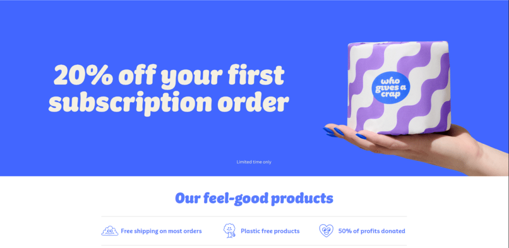
Who Gives A Crap makes it easy for eco-conscious shoppers to find responsibly sourced toilet paper. Their homepage does an excellent job of quickly communicating their core value proposition and social mission. Let’s take a look at some of the key elements that make their landing page effective at capturing attention and driving conversions:
- Clean, uncluttered layout allows the important elements to stand out
- Effective use of color contrast – the blue background and white text, contrasted with the product image stands out in the hero section.
- Clear value proposition summed up in the headline. Subscribe and save with 20% off
- Strong call-to-action buttons above the fold prompt visitors to shop
- Benefit-focused copy like plastic-free products and 50% of their profits donated
- Bold stats graphics communicate social impact and build credibility
- Simple navigation and product filtering make shopping easy
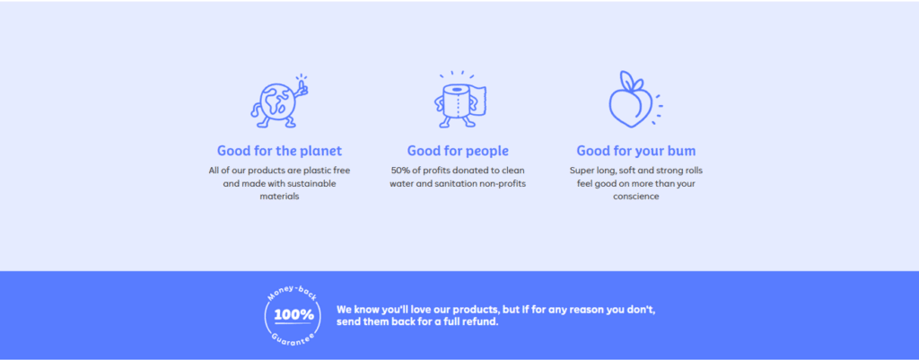
My favorite part of this landing page is actually at the bottom, where most visitors may not scroll all the way down to see. For those still on the page and need a bit more convincing that their product is the right choice for them, they employ this icon approach to quickly and succinctly communicate additional benefits of their toilet paper and products. And to put a bow on it all, at the end, they offer a 100% money-back guarantee – for those who were fence sitters before, imagine how powerful this guarantee is to convince visitors to convert.
Key Takeaway: When showcasing a product, use a simplified page layout approach to draw attention to your main message and benefits. If your product is driven by social/environmental impact, these impacts can replace or add to your existing product benefits for a conversion rate 1-2 punch.
Moving Services Example: Clutter
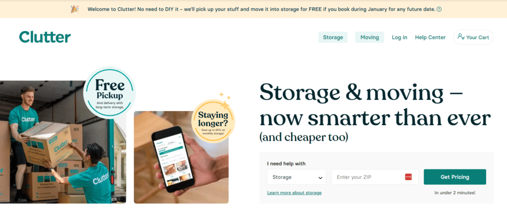
Clutter is a moving and storage company that makes it easy for people moving or needing storage to get the help they need. Their landing page design is worth admiring for many reasons listed below, but the hero section above is worth dissecting by itself. The headline is compelling, the photography is engaging and explains the process visually. On top of that, they manage to fit even more value in this hero with the “Free Pickup” and “Staying longer?” sections to further demonstrate their value. Finally, the CTA on the page is to simply get pricing, where they even explain the timing expectation.
Other elements worth mentioning include:
- Uses benefit-focused copy like “Storage & moving – now smarter than ever (and cheaper too)”
- Lists out the standalone services they offer in a clear, concise way
- Demonstrates social proof well with stats of how many people they’ve helped, as well as their partnerships with brands and celebrities that have trusted Clutter.
- Frequently asked questions at the bottom with further explanation and details of their service
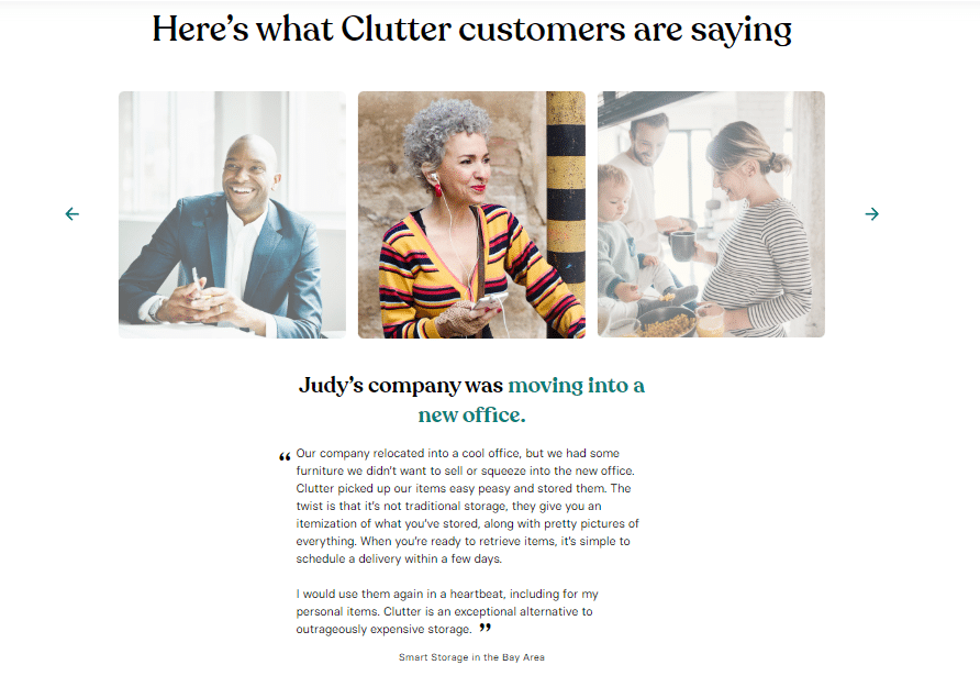
This landing page example is a masterclass in and of itself. However, I think the part that is most compelling is their testimonial section from real customers. It is designed well, focuses on the customer, and tells a story about how Clutter helped with a simple headline, color to focus on keywords, and a great quote. It elevates a good testimonial into a great story, which is far more compelling.
Key Takeaway: Provide as much value as you possibly can in the first section of your landing page, without breaking the design. Below that, focus on retaining the visitor’s attention and convincing them your service or product is the best choice.
Travel Services Example: Border Buddy
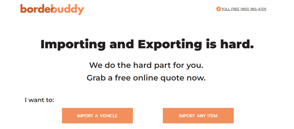
Border Buddy’s landing page is a great example of a simple, effective landing page design. If you know anything about getting anything like a vehicle imported, the process can be long and expensive. The page is refreshingly simple.
- Simple, effective color scheme and design
- Clear and scannable copy and headlines
- Strong calls-to-action
- Minimalist layout with plenty of space
- Steps on how the process works
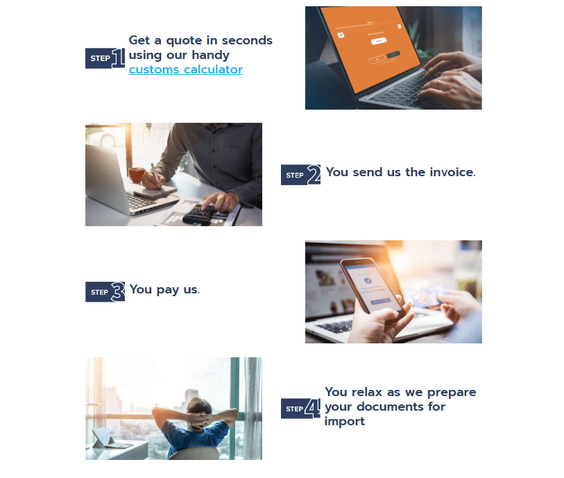
Right below the hero image, they include an easy step-by-step list of how their process works. Using numbered lists, sequence words like “first, next, then” and outline formats allows you to take readers by the hand and guide them down the page. Breaking the engagement with them into bite-sized achievable chunks also makes it appear far simpler and less intimidating.
Key Takeaway: When lack of a tangible “product” keeps you from using photography, short, pithy, and effective copy can be all you need to grab attention.
As you can see, stellar landing page design applies across all industries. Now let’s wrap up with some key takeaways.
Just a Few Tweaks and You Can Have a Winning Landing Page
Crafting effective landing pages is an art and a science that requires an understanding of your audience, strategic planning, and continuous refinement. As a world-class digital marketing agency that has developed hundreds of landing pages, we’ve equipped you with insights, strategies, and a few examples of landing pages to elevate your digital presence and drive tangible results.
Key Points
- Audience Understanding is Paramount: Tailor your landing page to resonate with your audience by understanding their needs, preferences, and pain points.
- Clear Goals Drive Success: Define specific and measurable goals for your landing page, aligning them with your overall marketing objectives.
- Design Matters: Create an eye-catching layout with clean design, mobile optimization, and compelling visuals that reinforce your brand identity.
- Compelling Copy Persuades: Craft persuasive headlines and concise, benefit-focused copy that communicates value and encourages action.
- Trust Elements Build Confidence: Incorporate trust elements such as testimonials, certifications, and secure payment icons to instill confidence in your audience.
- Multimedia Enhances Engagement: Leverage high-quality images and videos to tell a compelling visual story and engage visitors effectively.
- Mobile Optimization is Non-Negotiable: Ensure a seamless user experience on mobile devices, considering responsive design, fast loading, and mobile-specific content.
- A/B Testing Fuels Improvement: Embrace A/B testing and data-driven decision-making for continuous refinement and optimal conversion rates.
- Continuous Improvement is a Mindset: The digital landscape evolves, and so should your landing page. Regularly update content, adapt to industry trends, and implement user feedback for ongoing success.
Your Journey Continues
As you embark on the journey to transform your digital presence, remember that success is a continual process of refinement. Implement the strategies, test, analyze, and iterate. Your landing page is the gateway to your digital success—make it captivating, persuasive, and optimized for conversion.
Happy crafting and converting!

